August 9th, 2017
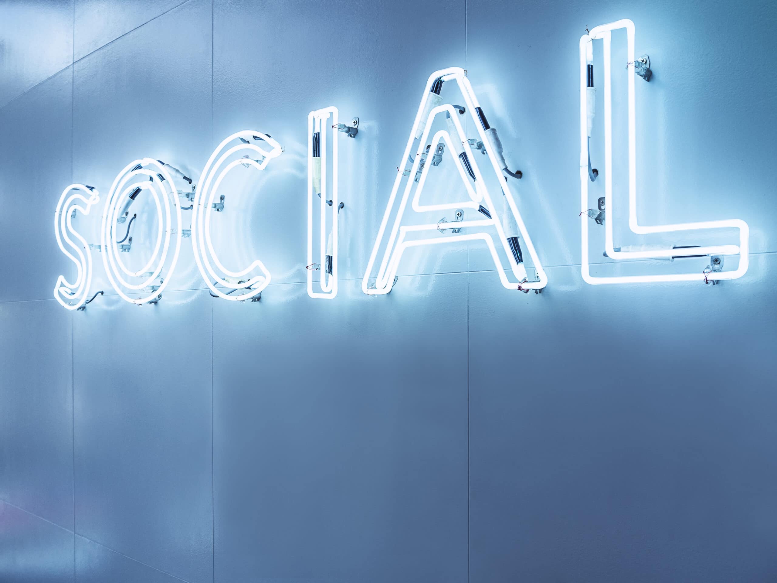
Typography is more than just lettering on a wall, it’s a story in and of itself. Type can be your voice, it can be a work of art, and it can be the exact touch your environment needs. Pull your entire space together with typography, keeping these details in mind:
It’s emotional.
When Witchita State University’s Software Usability Research Laboratory surveyed how type can affect a person’s feelings, they found that certain typefaces provoke specific emotions – who doesn’t feel sophisticated when using Times New Roman? Knowing that, it’s crucial to frame your typography in a way that can benefit your space, allowing visitors to become immersed in your message and feel whatever you want them to.
It’s inspirational.
Walk past a large wall with bold, punchy type displaying a quote, an idea, or even a title and just try not to feel something. By modifying typeface, color, size, and location, you can influence your visitors and more clearly get across who you are and what you stand for. If a picture is worth a thousand words, typography must be priceless.

It’s memorable.
It’s pretty hard to forget a compelling piece of art. Now imagine it’s spread across your wall, spelling out something you believe in, as on-lookers pass by. Your message is transformed into a work of art using type, bridging the gap between reading and visual learning.
Typography can completely alter your space, giving you the chance to impact through an art form that resonates with those who view it.
Next time you see typography that catches your eye, share it with us! Tweet us a picture @WeAreGilbert.
August 1st, 2017
August 16th, 2017